Understanding UI Toggle Switches: Enhancing Modern Digital Experiences
What Are Toggle Switches in User Interface Design?
In the realm of modern digital design, a toggle switch is a graphical user interface (GUI) element that allows users to instantly switch between two opposing states—most commonly, "on" and "off." Visually inspired by physical switches, these interactive components are a staple in web and mobile applications due to their intuitive nature and immediate feedback.
Toggle switches are often used in settings, forms, and dashboards to control binary options. Unlike checkboxes, which are more abstract, toggle switches offer a more tactile and visual representation of the action being performed. This makes them especially effective in applications where user clarity and engagement are crucial.
The Role of Toggle Switches in Modern Web and App Design
As digital interfaces evolve, so do the expectations of users. Today’s audiences demand intuitive, responsive, and visually appealing experiences. Toggle switches meet these expectations by providing a clean, interactive method of managing preferences, features, or settings within an application or website.
- Settings Panels: Toggle switches are commonly used to enable or disable features like notifications, dark mode, or privacy settings.
- Form Controls: In forms, they help users quickly agree to terms, opt-in for newsletters, or activate/deactivate account features.
- Interactive Dashboards: Toggle switches are used to filter data, switch between views, or manage access permissions in business tools and analytics platforms.
By integrating toggle switches into your design, you not only enhance usability but also align with current design trends that emphasize minimalism and interactivity.
Why Toggle Switches Matter in User Experience (UX)
Toggle switches are more than just aesthetic elements—they play a significant role in improving user experience. Here’s how:
- Clarity: They clearly indicate the current state (on/off), reducing user confusion compared to checkboxes or buttons.
- Immediate Feedback: Visual cues such as color changes or animations provide instant feedback, reinforcing the action taken.
- Efficiency: Users can toggle options with a single click or tap, streamlining the decision-making process.
- Consistency: When used consistently across platforms, toggle switches create a familiar interface, improving learnability.
For instance, in a mobile banking app, a toggle switch might allow users to quickly enable or disable card transactions. The visual feedback—like a green “on” indicator—gives users confidence that their action has been registered and applied.
Designing Effective Toggle Switches: Best Practices
While toggle switches are simple in concept, their effectiveness depends heavily on thoughtful design and implementation. Here are some key considerations:
1. Use Clear Visual States
Ensure that the "on" and "off" states are easily distinguishable. Common practices include using contrasting colors (e.g., green for on, gray for off) and adding subtle animations or transitions to reinforce the change.
2. Label Appropriately
Always pair toggle switches with clear labels that describe the action or setting they control. Avoid ambiguous terms like “enable” or “disable” without context. Instead, use descriptive text such as “Enable Notifications” or “Dark Mode On/Off.”
3. Consider Accessibility
Toggle switches should be accessible to all users, including those using screen readers or keyboard navigation. Proper ARIA attributes and focus indicators are essential for inclusivity.
4. Avoid Misuse
Don’t use toggle switches for actions that require confirmation or have irreversible consequences. For example, deleting an account or making a purchase should involve more deliberate steps than a simple toggle.
Common Misconceptions About Toggle Switches
Despite their popularity, there are several misconceptions surrounding toggle switches:
- They’re Always Better Than Checkboxes: While toggles are more visual, checkboxes may be more appropriate in forms where multiple options are available.
- They’re Only for Mobile: Toggle switches are equally effective on desktop interfaces, especially in dashboards and settings panels.
- They’re Simple to Implement: While the visual design may seem straightforward, ensuring accessibility and responsiveness across devices requires careful planning.
Understanding these nuances helps designers make informed decisions and avoid usability pitfalls.
Colorful and Interactive Toggle Switches in Modern Design
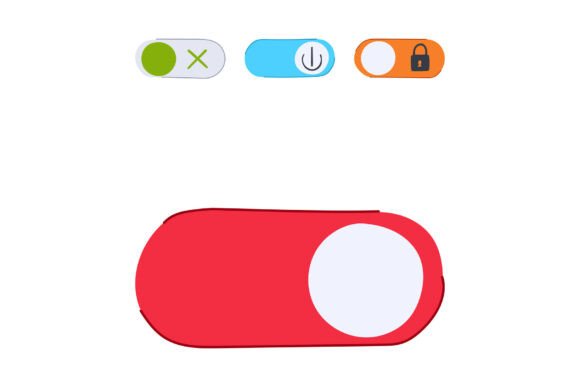
A growing trend in GUI design is the use of colorful and animated toggle switches to enhance visual appeal and user engagement. These elements often incorporate gradients, micro-interactions, or even sound effects to make the user experience more dynamic.
For example, a productivity app might use a vibrant toggle switch that pulses gently when activated, reinforcing the sense of accomplishment when completing a task. Similarly, a gaming platform might use toggle switches with custom icons and colors to match the game’s aesthetic.
Such designs not only improve aesthetics but also encourage user interaction and emotional connection with the product.
Integrating Toggle Switches into Your Design System
If you're building or updating a design system, incorporating toggle switches can help standardize your UI components and improve consistency across your digital products. Here's how to get started:
- Define Use Cases: Identify where toggle switches are most appropriate in your application or website.
- Create Reusable Components: Design toggle switches that can be easily reused across different pages and platforms.
- Document Guidelines: Provide clear documentation for developers and designers on how to implement and style toggle switches.
- Test Across Devices: Ensure toggle switches are responsive and work seamlessly on both touch and non-touch devices.
By treating toggle switches as part of your core design language, you ensure a cohesive and user-friendly experience throughout your digital ecosystem.
Real-World Examples of Toggle Switches in Action
Here are a few real-world examples that demonstrate the versatility and effectiveness of toggle switches:
- Smart Home Applications: Toggle switches are used to turn lights, thermostats, or security systems on or off with a single tap.
- Streaming Services: Platforms like Netflix or Spotify use toggle switches to let users enable parental controls or shuffle play.
- E-commerce Platforms: Toggle switches allow users to filter products by availability, price range, or customer ratings.
These examples illustrate how toggle switches can be applied across industries to simplify user interactions and enhance functionality.
Conclusion: The Future of Toggle Switches in UI Design
As digital interfaces continue to evolve, toggle switches will remain a vital component of modern design. Their ability to convey binary choices in a clear, interactive, and visually appealing manner makes them indispensable in today’s fast-paced digital world.
Whether you're a beginner designer or an experienced developer, understanding how to effectively implement toggle switches can significantly enhance your product’s usability and user satisfaction. By following best practices and staying attuned to design trends, you can create interfaces that are not only functional but also delightful to use.
Incorporate toggle switches thoughtfully into your next project, and you’ll be taking a meaningful step toward creating a more intuitive and engaging digital experience.